Wednesday 19 October 2016

Magazine Analysis- Front Cover 2


Magazine Analysis

In this magazine cover, there is a large image of Beyoncé at the front, who is known to be one of the prettiest and talented singers. The magazine chose to put her at the front as she is well known, talented and pretty which makes her one of the best, this attracts many people to buy the magazine.

However, Beyoncé is not the only person on the front page, other 3 celebrities are on their which one of them is Nikki Minaj, who is also a very popular singer in the music industry. Doing this is a clever way to attract a variety of people, not only Beyoncé fans but also Nikki Minaj’s fans.  

The mast head which says “Love it or list it?” is a rhetorical question placed at the front with a big and bold font. This technique is used to make the customer think and make them curious of what might be inside; thus, this makes them want to buy it.

In addition, a small section in the corner talks about one of the articles which says “Tiny Brushes of Mayweather comments”. This is a way to attract people as the article is gossip about what’s happening in celebrities lives. This makes people want to buy it as customers would want to know what it is like to be a celebrity.

Magazine Analysis- Front Cover


Magazine Analysis

The masthead on the magazine cover says “KING” in capitals. This suggests that this magazine is aimed at men as it is bold and muscular. Jay Z is put on the front cover as he is well known which attracts customers. The image is a long shot where we can see Jay Z’s posture and facial expression; he has his hands tucked into his pockets which suggests he doesn’t care, as well as the way he is looking down at the camera which portrays leadership and power that men have stereotypically.

The colours used are black and white which contrasts with the neon subheadings and buttons. This represents the genre hip hop effectively as hip hop is known to be loud and bold. This links in with the bold font used also to illustrate how men are portrayed in society.

The skyline is a hyperbole as it says “Hip-Hop Magazine No1 in Russia”, this exaggerates the fact that the magazine is so good that it makes people want to purchase it. The word “No1” suggests that they are the best so they must have really good content inside the magazine.

Not only men are aimed to buy the magazine, females can also be attracted as words such as “Sexy Pics” attracts particularly females to purchase, as well as other people who are a fan of “Lil Wayne”, “Eminem” and “Akon” as their names are written in bold on the side. This means that they might have some content inside of the magazine that talks about those artists.  

Sunday 16 October 2016

Gender Representation


Gender Representation

I have researched the ways media represents men and women very differently in magazine covers.  Gender representation is the essential elements of our own identity, and the identities we assume other people to have, come from concepts of gender – i.e. what it means to be a boy or a girl / man or woman that are separate from biological differences. The media in general and advertising in particular, does not show us the real world.

The magazine on the left represents men as very masculine. As we can see, the man does not have a shirt on and his body is exposed to show how muscular he is. This is a way to attract people to buy the magazine as they made the mid shot the main focus. This representation portrays men in society. However, Trey Songz is a singer not a model, the cover line says “the hardest in R&B”, this pun says that he is not only the best (hardest) in R&B; he is also muscular (hardest) physically. The magazine “vibe” used this tactic to represent Trey Songz as one of the bests in order to gain more sales,

In most media portrayals, male characters are rewarded for self-control and the control of others, aggression and violence. We can see leadership through the way he is standing straight with his eyes looking directly at the camera, not smiling which shows control.

In contrast, the cover on the right’s main photo is a long shot of the singer “Ciara” who is seen as beautiful in the media. This is because the long shot exposes her long sleek legs and her fancy heels. Women are usually seen as sex objects due to the stereotypes of the weaknesses of women. We can see this through the way she is sitting, compared to the man standing straight; she is slouching with her legs open which links to the sex object stereotype

Design Elements


The examples of hip hop magazine covers are popular with using the “T” layout in order for the main picture to standing out. It creates a T shape as the long shot image combines with the mast head. This supports the narrative of the page as the layout is very sharp and direct, it is quite straight forward similar to hip hop.


The font is usually sans- serif which is bold and represents the power of the hip hop genre known to be loud and masculine. Examples are

Example/Example/Example

The important of using the mast head  is so people can familiarize as the name “vibe” comes from the genre hip hop,  this is due to the informality. The word in the cover line “POP” is in bold as this technique can attract customers who are into pop and hip hop music.
 

The colour schemes used in both magazines covers are very dark as the background with usually a bright/neon writing to contrast. This represents the genre hip hop as a whole as it relates to the low music background as the back with loud rap on top.


Friday 14 October 2016

The Conjuring 2- Film Scene Analysis (Additional Work)


The Conjuring 2- Film Scene Analysis
 
In this scene, the lighting is “Low Key Lighting”. This is used to mainly focus on the facial expressions which are seen to be as shocked as their mouths are open. This then builds up tension as the audience wants to know what is wrong. The lighting in the background is dark, this shows that the background may be irrelevant to the scene, and also if it was to be shown then there would be less focus on the characters.
The dark earthy colours used as the background suggests this is a horror movie as the colour back connotes death. Another way the director puts the focus on the facial expressions is by having the scene as a mid-shot, which only shows the middle upwards along with the blurred setting at the back.
In addition, the most lighting is lit on the side of the door which they are standing next to. This questions that there may be something inside the room which creates mystery and makes the audience think. This is called “enigma”
The woman’s costume at the front is coloured which makes her stand out as the background is earthed colours and her top is light blue, this helps the audience to understand that she is the main character. In contrast the girl at the back is wearing all black which makes her camouflage into the background. The director may do this as she is not important in the scene, this is called “Symbolic Annihilation” which is used to show that the character does not have a voice or say in that particular scene.

Thursday 13 October 2016

Lighting Used in Scenes (Additional Work)

Lighting


High Key Lighting

This produces a brightly lit image so we as the audience can see the details and props used. The lighting is brightly lit on the man to show he is in pain and moves the attention to him rather than the man in the back who has shadows on his face- making him out of focus from the scene. This portrays a action genre.


Low Key Lighting

Uses backlights to create distinct shadows. This portrays a horror or crime scene and builds tension. This affects the character as he looks confused due to the low lights, it may also illustrate that he is having trouble seeing therefore he is looking up.


High Key Lighting 

The lighting here is used to create a realistic view so the audience can feel as if they are in the scene. Also because they are moving around as this may be a action movie, so having bright lighting won't build tension within the audience.


Low Key Lighting

Shadows here are used to make the audience focus on a certain area. For example, the main focus here is background, not the man standing. This makes the character not in the scene even though we can visually see him. (Miss en Scene) This shows a mystery or crime genre.


Backlighting

This makes the subject appear sacred or mystical as it creates a ‘halo’ effect which comes from the lighting at the top left. This makes us focus on what's sitting next to the characters that is brightly lit, rather than the characters facial expressions. This shows a horror genre


High Key Lighting

The lighting used here is to reflect a natural scene as well as showing the time of day, this helps the audience to understand the context and make us feel as if we were in the scene. The characters here don't look like they are acting at all as there is no bright lights shining on their faces, the whole view is in focus in this scene.


Wednesday 12 October 2016

Camera Angles (Additional Work)


Camera Angles
 
 
High Angle:

A birds eye view of the scene. This is a good use of uses and gratification theory as this makes the audience feel superior as we can see she is looking up at something


Establishing Shot:

This is a angle where the audience can clearly see the setting behind which sets the atmosphere and we can see the full character. This clearly represents the romance genre as they are holding hands which shows they are in love.

Close Up:

This shot is a close up of the character, which empazises the facial expression on her face and blurs the background

Thursday 6 October 2016

Facial Expression & Body Language (Additional Work)


The characters in the scene are wearing casual and comfortable clothes. This shows that they are teenagers as stereotypically teenagers usually don’t put effort in their outfits. The colours of the clothes are earthed colours and are quite boring, the director may choose this to create a realistic atmosphere and it doesn’t distract the audience as it blends into the dull background. This scene gives tension as the facial expressions are quite serious but is mainly aimed at the older guy who looks angry. The leaning in body language and angry facial expression may suggest that he is advising the boy.


The characters in this scene are all wearing suits which represents a high standard/status. Also, the main character in focus wearing black is standing up straight with his head held high, this shows that he is confident. However, his hands are closed tightly which may show that he is nervous as he is closed up. In contract, the man at the back standing does not look happy as he is pointing at the first character which portrays he is accusing him of something. He is also wearing the green which is a earthed colour, this makes him blend into the background. The director does this to make the main character in focus by making him wear a opposite colour to the rest to represent importance.


In this scene, we can see that this was based in the olden days. We can interpret this through the hair of the boy which is very old fashioned as well as the props behind which are ceramic tea pots and tea cups. The facial expression of the boy shows he is upset as we can see this through the tears on his face. In contrast, the man in front looks like he is happy as he has a smirk on his face; this suggests that the boy may be getting teased. The director may have chosen to use the dimmed atmosphere to create tension.

Mise en Scene (Additional Work)


The Big Bang Theory

-          Set in a kitchen as this is a typical where families have their conversations

-          This gives a very casual effect and makes it look realistic, also the clothes they are wearing are very casual as is it something you would wear at home

-          The props that are used are cooking products which is held by the only woman. This illustrates a stereotype that all women belong in the kitchen

-          alcohol represents the characters as young adults,  immature and want to have fun. This fits into the comedy genre


The Missouri Breaks

-          Set outdoors in a deserted  place which may suggest this is a action movie

-          This gives a cold effect as they are all wearing coats, which also suggests they are cow boys as the coats are long and brown, which originates from olden western movie costumes.  

-          The props used are hats which portray that they are Western and Cowboys

-          The fact that they are looking away suggests the outfits are in focus as well as the setting

Sunday 2 October 2016

Evaluation & Final Piece


Evaluation

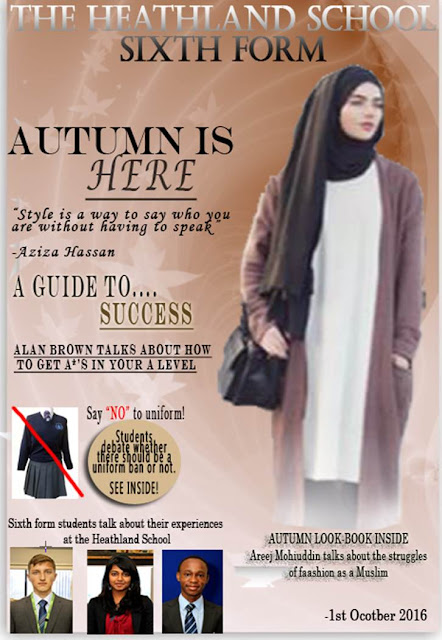
My Magazine cover is similar to real media products as I have used the following; a masthead, skyline, button, kicker and a large image to portray my main article.
If the school was to publish my magazine I would prefer to distribute it via the internet, this is because my magazine includes a variety of look-books and fashion tips. Therefore, having it published online would be easier so I could link each clothing item to the shops website, to make it easier for students to browse and buy the item.
My magazine was mainly targeted at sixth formers and for both male and females. I have achieved this successfully as even though my articles are mainly based on fashion, there are other interesting topics included such as “how to get straight A*’s” and “Sixth formers opinions on Sixth form”. These have broadened my target audiences needs and suits both male and females.
From the process of constructing my product, I have learnt new things about technologies. One of which was starting a new blog, this has taught me new ways to interact with the outside world with just a few clicks and it has also broadened my knowledge about the media.
Overall, doing this task, the main thing I have learnt is how to use Photoshop and illustrate my creative ideas onto my magazine cover. I have more knowledge on how to use different tools such as the stamp tool, which was used to add texture to my background. As well as the lasso tool, which helped me cut around shapes and made it easy to attach it to the cover.